Dalit Steinbrecher
Hi there! my name is Dalit Steinbrecher, don’t feel bad if you
can't pronounce my name, even in Isreal (where I was born) it's an
uncommon name. I'm a product designer currently based in New
York....
for more info/contact
UX/ UI design
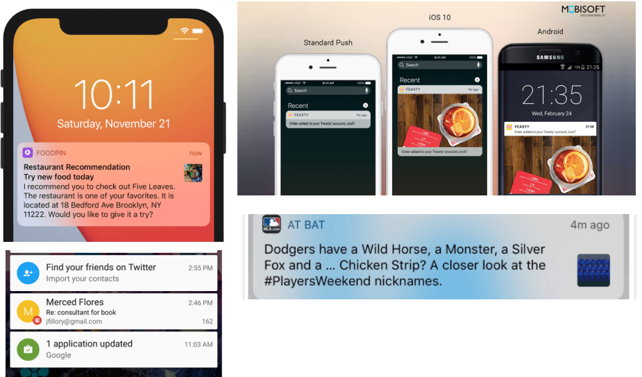
Notification
Taboola is an advertising-based technology company. Taboola users
are mostly publishers, Taboola is an
advertising-based technology company. Taboola users are
mostly publishers and one of their biggest challenges is to
attract mobile users (the readers) to their articles. Taboola,
together with android, wants to create a system that will attract
more users to those publishers’ pages. I started to explore the
notification world: what is a notification? why do users open
notifications? when do they ignore it? and what kind of
notification engages them?
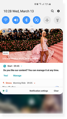
Former research that we have done showed that users responded
better to images or videos than text. So, the option of combining
a video or an image inside the notification interested me. I
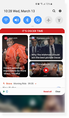
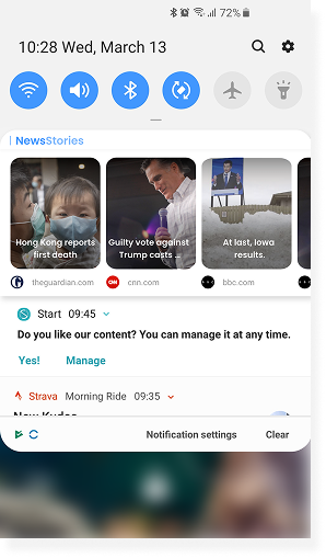
created 2 directions: The first, is a spread of notifications with
the same content, for example, all the newest articles about the
superball.
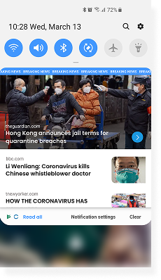
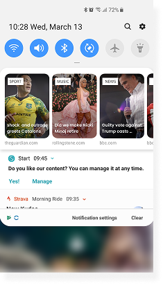
The other option was a diverse notification with different
content, every notification offered an article on a different
subject:
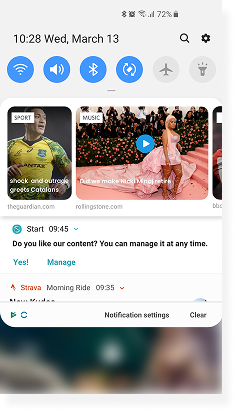
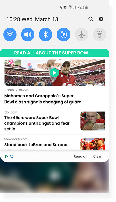
After A/B tasting both directions, we noticed that better
engagement with diverse content notifications, we hypothesized
the users had a higher chance of finding subjects that they were
interested in. In order to check our theory I wanted to try
another version: the visual language of the first version with
only one kind of content.
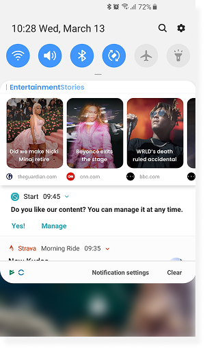
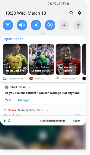
The A/B testing yielded good results: all users understood the
experience of scrolling to the right and clicking on the images
in order to explore the articles. The click-through rate went up
significantly. So the visual above with one kind of content was
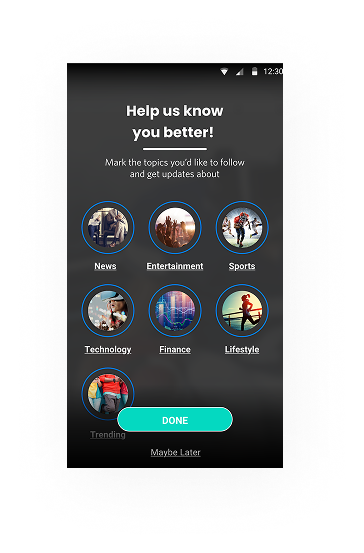
chosen. The only thing we realized is that the user needed to
control and prioritize what kind of content they were getting
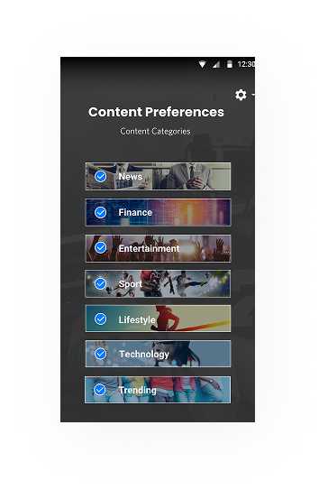
and that is why we also created an "on boarding" phase. I
designed this phase with a list of the different content types.
As a default, all the types were checked and the user could
unmark them and control what kind of content they would get. We
tested a few different spreads:
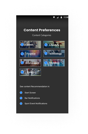
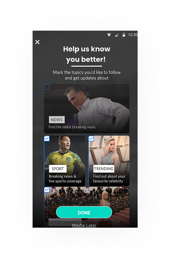
We decided to test the ones that got the highest score of
engagement again. We added another feature- number of people
thaat subscribed to this content
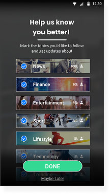
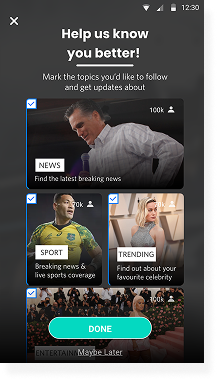
We noticed that the engagement rate went up once this feature
was added, and after the A/B testing results we decided to with
the option on the right.